


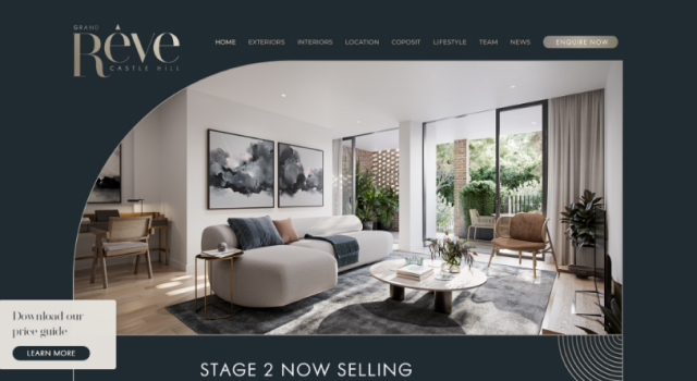
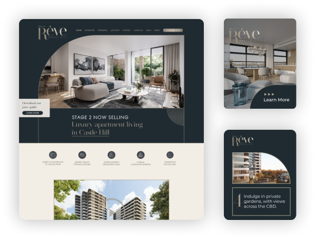
“On behalf of McGrath Projects and Kassis Homes, I would like to acknowledge the challenging work Flynn, Preet and the AEK team have undertaken. Their efforts have dramatically increased the Grand Reve branding and awareness which has resulted in a higher volume of qualified leads directly enquiring on the project ”

Adam Sparkes Associate Director at McGrath Projects

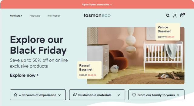
“Totally Professional and have a very good understanding on developing a fully functional Ecommerce platform that delivers results. Great bunch of guys to work with who are always willing to listen to our thoughts and ideas. We see them as a long term partner as we grow our online platforms. ”

Steve Cenatiempo Director at Tasman Eco

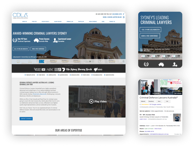
“Absolute pleasure to work with this experienced team of professionals. They are now an integral part of our team who are perfectly tailored for small, medium & large businesses to generate leads and strategies.”

Jimmy Singh Principal Lawyer at CDLA


